

How Businesses can understand and harness the power of color psychology in branding and marketing
If you know me, you know I nerd out about colors & color psychology in branding. As a brand designer, I love curating the perfect color palette for a brand identity. But I don’t just love colors for the sake of aesthetics. I love them because they can stimulate both our minds—and our bodies.
Colors are powerful communicators, silently and subconsciously influencing our emotions, behaviors, and perceptions. Certain hues can trigger very real, very physical responses in our bodies. It can also trigger strong emotions or memories associated with these colors.
Colors on our walls, our furniture, our clothing, and our *stuff* can make us feel happy, sad, gloomy, hungry, and so many emotions. Not only can colors affect our moods and emotions, but they can also affect our behaviors—specifically our consumer behavior (aka our buying habits).
We could fill novels and novels (and they have) of research about color psychology. But for the sake of this blog post not being thousands of pages long, I’ll be diving into the unique effects of individual colors—emphasizing how to understand and use color psychology in branding and marketing.
Because believe me when I say, colors can be INSANELY powerful in your marketing. In fact, 90% of people will choose your brand based on color alone. And when used correctly, they can help to reinforce brand identity and boost brand recognition.
Now… before I get too far. Let me preface that color psychology in branding is not an exact science. While it’s fascinating to see research studies and REAL facts, it’s important to remember that reactions to color can be highly personal. We are wildly complicated beings, so it makes sense that our responses and associations may differ depending on how we grew up, our experiences, the culture we are raised in, and even the brands we are exposed to.
But for today, let’s focus on the bigger picture and remember that there will always be exceptions – and you can always break the rules.
THE BASICS OF COLOR THEORY
Before we get into the chaos of combining colors and creating color palettes, I think it’s best to lay a solid foundation of color psychology in branding by focusing first on the individual colors. And to do that we need a little refresher on color theory.
You might remember from your elementary school days, or perhaps from your art classes—but just as a refresher: We have 3 primary colors (Red, Blue, and Yellow). Combinations of these colors will produce our secondary colors (Orange, Purple, and Green).
Red + Yellow = Orange
Red + Blue = Purple
Yellow + Blue = Green
And from these 6 colors, along with the help of good ol’ black and white, you can create literally every shade you could possibly imagine.
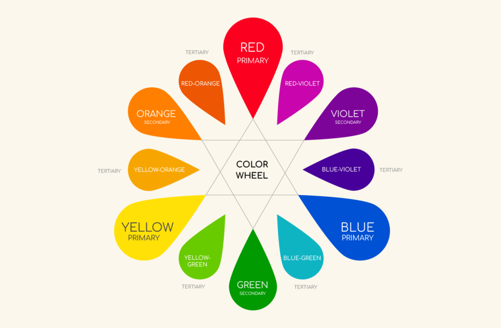
Why do I bother bringing this up? Because while we’ll start with the primary colors, you’ll notice overlapping emotions, physical responses, and associations. This is because when you mix colors, it the new color often becomes a hybrid of the colors it came from. When you understand this, you have so much more control over the responses and perceptions you WANT your audience to have.
Okeeee you’re all caught up, now let’s dive in.
Red Color Psychology: The Color of Passion and Danger
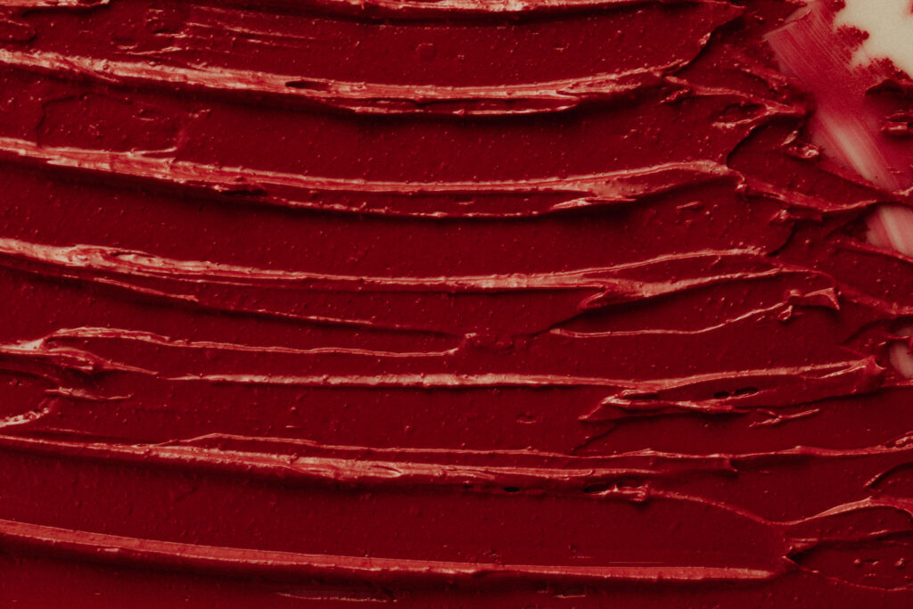
Red is the most intense color. It demands our attention and can invoke strong emotions of passion, love, or anger. With such strong and diverse reactions, it can be a tricky color for marketers.
Understanding the associations we have with Red
When we see red, we commonly think of love, passion, and power. It’s a sexy color. In fact— we tend to view people wearing red as more attractive. You also might have noticed that wearing red can give you a sense of elevated confidence. When we see red, it can increase our heart rate and elevate our blood pressure.
There’s no denying that red is an attention-grabbing color. This is why fire departments, stop signs, traffic lights, and breaking news banners, all use red to catch our attention. We have an instinctual reaction of Urgency or Danger when seeing the color red, perhaps triggered by the typically negative association of blood. This sense of urgency can elevate our blood pressure and alertness so it’s often regarded as a very stimulating color.
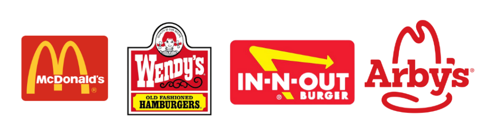
Red is also known to stimulate our appetite, as a color that often occurs naturally in food (think: ripe fruit and berries, tomatoes, veggies, and meat). This, coupled with the fact that red can give us a sense of urgency and impulsivity, is why practically every fast food restaurant uses red color psychology in their branding.
For marketers considering red, the last thing I’ll share is this. Certain colors can stimulate or dampen purchasing behavior. Red just so happens to be one color that encourages purchases. With the sense of urgency and excitement associated with red, many buyers impulsively react to it. This is why you’ll often see sale signs or buy now buttons in red. Just be sure you don’t go overboard though, because red can strain our eyes in large doses.
If you’re considering using red color psychology in your branding, it’s fantastic if you’re in the food industry or anything associated with romance or passion. But red is by no means limited to certain industries. As long as you’re ready to show up boldly, red just might be your cup of tea.
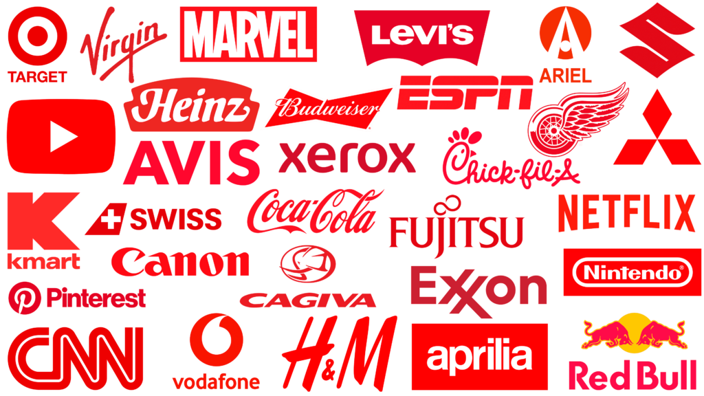
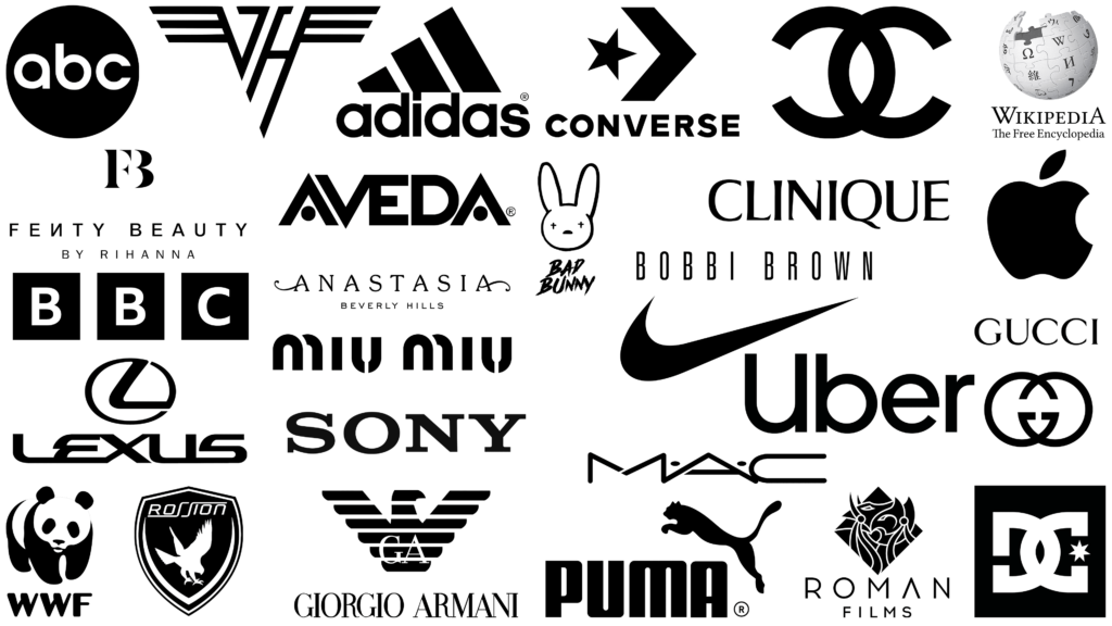
Brands that use Red
To recap:
- Physical Reactions: Increased heart rate, elevated blood pressure, stimulates appetite, energizing, stimulating, promotes a sense of urgency
- Emotional Association: Passion, love, energy, power, daring, danger, dominance, excitement
- Consumer Behavior: motivates us to take action, increases confidence levels, encourages purchases
- Brands: Coca-Cola, Red Bull, Target, YouTube
Using Red Color Psychology in Branding and Exploring Different Shades
Of course, varying shades of Red can have slightly different effects on us. Brighter shades tend to be more exciting and energetic, while dark red is perceived as more professional, luxurious, and dare I say—more sultry.

Blue Color Psychology: The Color of Soothing and Stability
If you’ve ever wondered why blue seems overly used in branding — it’s for good reason. Of all the colors you could choose for your brand, blue is as safe as it gets.
Fun fact: Blue is the most common favorite color in both men and women. And since it’s favored by so many people, it’s seen as a very non-threatening, traditional, and conservative color.
Understanding the associations we have with Blue
When you think of blue, the first things that come to mind are probably the sky, the ocean, and water. As a color found often in nature, it has a calming influence that soothes and relaxes us. Because of these same associations, blue is often associated with spirituality by those who feel connected to the heavens or bodies of water spiritually.
Blue is also seen as trustworthy, dependable, and secure. This is why so many police departments use this color and we have learned to associate it with authority. It’s also used by many companies in the tech or finance industry where they especially want people to have a sense of trust and confidence in the brand.
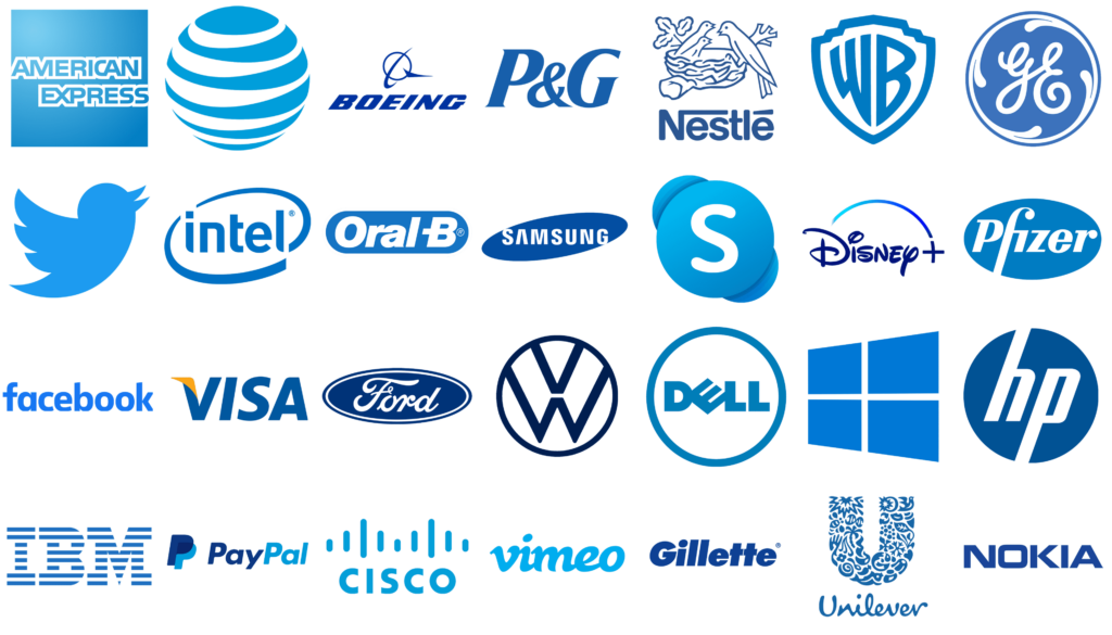
Brands that use Blue
You do have to be careful using blue, however. While red is energizing and stimulating, blue has quite the opposite effect. It’s been found to reduce your heart rate and body temperature, causing you to feel sleeeeeeppyyyyyy. And while red can feel vibrant and passionate, we’ve all heard the term “feeling blue”, and it didn’t come from nowhere. Blue can create feelings of sadness. It can feel icy, distant, or cold if not used carefully or paired with other colors to brighten it up.
Blue has also been found to decrease appetite. This appetite loss may be because this is not a color we commonly find in food – and if you see it in food, it might be spoiled or poisonous. So if you are in the food biz, this might be a color you want to avoid.
If you are considering the use of blue color psychology in branding and marketing, it’s perfect if you want people to think of your brand as reliable, secure, and safe. It’s great for businesses in the finance, tech, or health industry, just be sure to find other ways to make yourself stand out—because your color won’t be the one that does that for you.
To recap:
- Physical Reaction: Decreased heart rate, calming effect, decrease in appetite, encourages relaxation and calmness
- Emotional Association: Trust, stability, confidence, credibility, security.
- Consumer Behavior: increased trust levels, positive feelings towards the company
- Brands: Facebook, IBM, Samsung, Dell
Using Blue Color Psychology in Branding and Exploring Different Shades
Blue communicates confidence, strength, reliability, and unity. When we want to look more professional and serious, a darker blue may fit better while the lighter blues may feel more breezy, calming, and lighter. With colors like turquoise which has green added, you may see a combination of both green and blue traits.

Yellow Color Psychology: The Color of Optimism and Warmth
Yellow is one of the most cheerful and vibrant colors on the spectrum. Having a splash of yellow in a room can instantly brighten your mood. It radiates warmth, energy, and positivity, making it a powerful tool for influencing mood and behavior. However, like all colors, yellow has its nuances and complexities.
Understanding the associations we have with Yellow
When we think of yellow, the first things that come to mind are sunshine, happiness, and optimism. It’s a color that instantly lifts spirits and evokes a sense of joy and playfulness. This bright hue is often associated with creativity and intellectual energy, making it a favorite among educators and creative industries.
Yellow has the unique ability to capture attention without the aggressive intensity of red. It stands out in a subtle yet striking manner, which makes us pause and take a look at our surroundings. This is why yellow is commonly used for warning signs, caution tapes, and school buses. Its visibility ensures that messages are conveyed clearly and promptly – yet we read it as more of a CAUTION, rather than danger, like we do with red.
One interesting psychological reaction to yellow is its ability to stimulate mental activity. It’s known to encourage communication and increase concentration, which is why legal pads and notepads often come in yellow, and having bright yellow objects in a room can stimulate creativity. This color can inspire clarity of thought and a more upbeat, energetic mindset. It is often associated with originality or innovativeness.
However, yellow can also have a downside. In large quantities, it can become overwhelming and may lead to feelings of anxiety or agitation. This is because its brightness can be too stimulating and might cause visual fatigue over time. But everything in moderation, right?
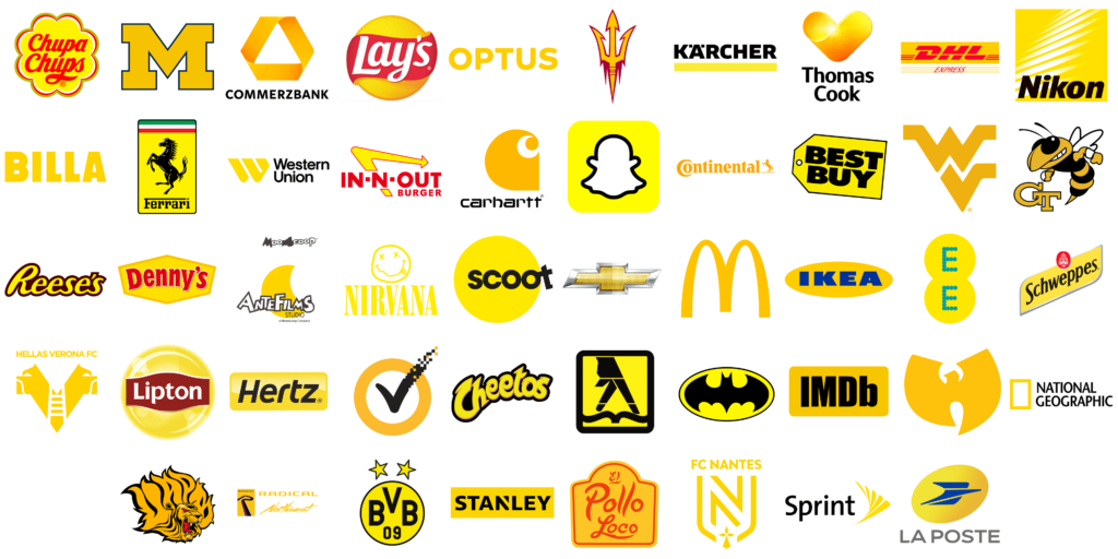
Brands that use Yellow
For marketers, yellow is a fantastic choice for brands that want to be seen as friendly, approachable, and youthful. It’s commonly used by companies that want to convey happiness and positivity. Think of brands like McDonald’s (again) which uses yellow to promote a fun and joyful dining experience, or Snapchat, which associates its bright yellow logo with creativity and spontaneity.
When considering using yellow color psychology in your branding and marketing, it’s ideal for industries related to food, children’s products, and anything that wants to promote a sense of joy and energy. However, be mindful of its intensity and balance it with other colors to avoid overstimulation, and be cautioned that yellow can often be viewed as cheap or fun.
To recap:
- Physical Reaction: Stimulates mental activity, increases energy levels, improves concentration, a heightened level of awareness, energizing, promotes optimism and creativity, induces a playful, happy, comedic mood.
- Emotional Association: Uplifting, happiness, positivity, warmth, friendliness, cheerfulness
- Consumer Behavior: Attracts attention, encourages communication, inspires creativity and spontaneity.
- Brands: Mcdonald’s, IKEA, Snapchat
Using Yellow Color Psychology in Branding and Exploring Different Shades
Like any other color, the variations of yellow can evoke different responses. Bright yellows are lively and cheerful, perfect for grabbing attention and conveying energy. In contrast, muted or pastel yellows can be calming and soothing, making them suitable for creating a more relaxed and friendly environment. Mustardy or earthy yellows are also associated with higher-end brands rather than the bright and vibrant yellow in its purest form.

Green Color Psychology: The Color of Balance and Renewal
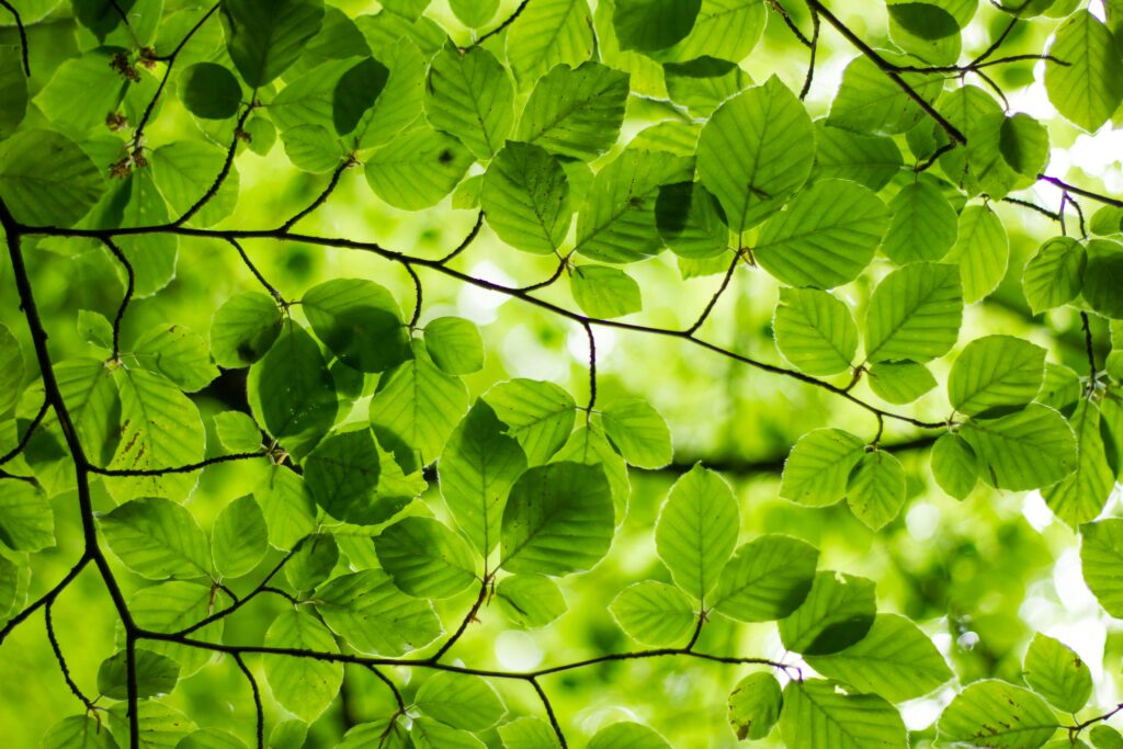
Green is the epitome of nature, growth, and harmony. It’s a powerful combination of the soothing effect of blue and the rejuvenation of yellow. This makes it a versatile and powerful color in psychology and marketing.
Understanding the associations we have with Green
When we think of green, the first associations are often with nature, plants, and health. It’s a color that symbolizes renewal and life, bringing images of lush forests, fresh leaves, and freshly mowed grass. With Green feeling so earthy, it is also associated with balance and stability, making it a popular choice for creating a sense of calm and serenity.
Green has a unique ability to relax our muscles and ease our minds. It’s the easiest color for our eyes to process and is known to reduce stress and anxiety, promoting a sense of peace. This calming effect is why green is often used in environments where relaxation is key, such as hospitals, spas, and wellness centers. It’s a color that can help lower heart rates and create a feeling of safety and comfort.
From a psychological perspective, green is often linked to feelings of abundance and prosperity. This is why it’s commonly used in financial sectors and products related to wealth and success. Green also signifies freshness and vitality, making it a great choice for brands associated with health, wellness, and the environment.
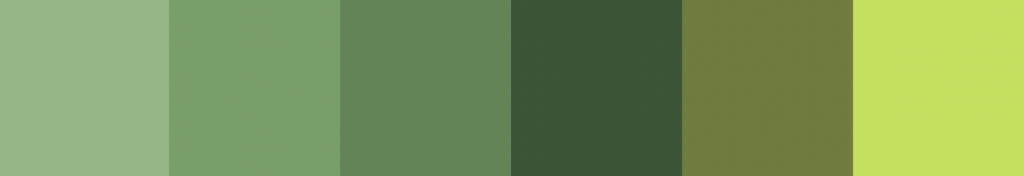
However, not all shades of green are created equal. While bright, vibrant greens can convey energy and youthfulness, darker greens are often associated with luxury, sophistication, and stability. This is why you’ll see darker greens in brands that want to project a more professional and high-end image.
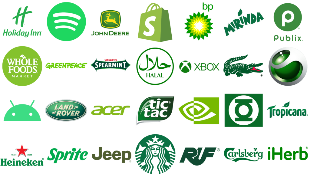
For marketers, green is a fantastic choice for brands that want to be seen as trustworthy, natural, and health-conscious. It’s widely used in the food industry, particularly for products that emphasize organic and healthy ingredients. Brands like Whole Foods and Tropicana utilize green to convey their commitment to quality and natural goodness.
Brands that use Green
If you’re considering using green color psychology in your branding and marketing, it’s ideal for industries related to health, environment, and finance. It’s also a great choice for creating a sense of calm and trust in your audience.
To recap:
- Physical Reaction: Relaxes muscles, reduces eye strain, promotes a sense of calm, and reduces stress
- Emotional Association: Renewal, growth, stability, balance, prosperity, harmony, freshness, health, nature and the environment
- Consumer Behavior: Encourages trust, promotes health-conscious choices, associated with wealth and success
- Brands: Starbucks, Whole Foods, Tropicana, Grammarly, John Deere
Using Green Color Psychology in Branding and Exploring Different Shades
Different shades of green can evoke different responses. Bright, lime greens are energizing and invigorating. This makes it perfect for brands that target younger audiences or promote fresh, new ideas. Darker, forest greens convey a sense of luxury and stability, making them suitable for more established and professional brands. Pastel greens can be soft and calming, ideal for settings where a serene atmosphere is desired.
Orange Color Psychology: The Color of Energy and Enthusiasm
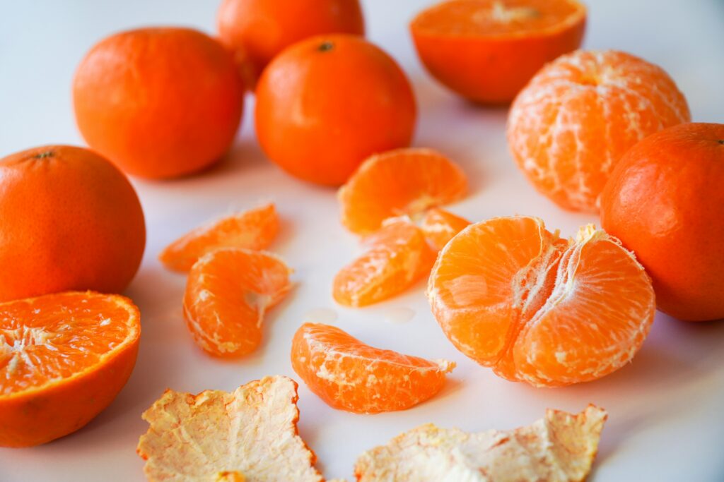
Orange is a vibrant and energetic color that combines the warmth of red and the cheerfulness of yellow. It radiates excitement, enthusiasm, and positivity, making it a powerful tool in psychology and marketing.
Understanding the associations we have with Orange
When we think of orange, we often think of warmth, sunshine, and vitality. It’s a color that can evoke feelings of happiness and energy, and a zest for life and optimism, making it perfect for capturing attention and encouraging action. This lively hue is often associated with creativity and adventure, inspiring people to embrace new experiences and ideas.
Orange has a unique ability to stimulate both mental and physical activity. It’s known to increase oxygen supply to the brain, producing an invigorating effect that can boost alertness and creativity. This makes Orange the ideal choice for environments where energy and enthusiasm are desired, such as gyms, sports events, and creative spaces.
From a psychological perspective, orange can promote feelings of socialization and communication. It’s a friendly and inviting color that can encourage interaction and collaboration, making it a great choice for social settings and community-oriented brands.
However, the intensity of the orange can also be overwhelming if overused. In large quantities, it can become too stimulating and may lead to feelings of agitation or restlessness. Therefore it’s important to use orange in moderation, especially in environments where calm and focus are needed.
Brands that use Orange
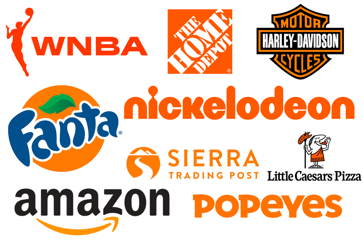
For marketers, orange is a fantastic choice for brands that want to be seen as fun, energetic, and approachable. It’s commonly used by companies in the food, sports, and entertainment industries. Think of brands like Fanta, which uses orange to convey a sense of fun and refreshment, or Home Depot, which associates orange with energy and DIY enthusiasm.
If you’re considering using orange color psychology in your branding and marketing, it’s ideal for industries related to food, fitness, and creativity. It’s a color that can add a touch of excitement and warmth to your brand, making it memorable and engaging. Be careful with orange. It’s typically associated with affordableness, which can sometimes become cheapness. A more subtle peachy shade is often associated with a higher scale market, or adding black on orange can increase the perceived value. Also, lil fun fact—orange is the color that children like the most.
To recap:
- Physical Reaction: Stimulates appetite, increases energy, stimulates mental and physical activity
- Psychological Reaction: Energizing, social, promotes enthusiasm and creativity
- Emotional Association: Excitement, warmth, friendliness, happiness, adventure
- Consumer Behavior: encourages interaction, attracts those seeking fun and energy, is associated with action and dynamism, and is eye-catching.
- Brands: Fanta, Harley Davidson, Nickelodeon, Home Depot, Sierra Trading Post
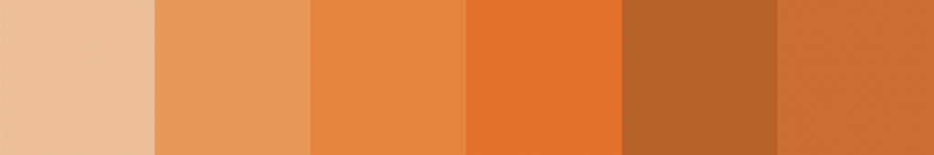
Using Orange Color Psychology in Branding and Exploring Different Shades
Different shades of orange can evoke different responses. Bright, bold oranges are lively and attention-grabbing, perfect for creating a sense of excitement and urgency. Softer, peachy oranges are more calming and approachable, suitable for promoting a friendly and inviting atmosphere. Deep, burnt oranges convey warmth and reliability, making them ideal for creating a sense of comfort and stability.
Purple Color Psychology: The Color of Luxury and Mystery
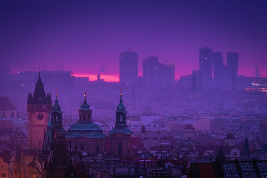
Purple is a color that combines the calm stability of blue and the fierce energy of red. It’s often associated with royalty, luxury, and spirituality, making it a color that exudes a sense of elegance and sophistication.
Understanding the associations we have with Purple
When we think of purple, we often think of nobility. Historically, purple dye was rare and expensive, reserved for the elite and royal families. This association with wealth and power continues today, with purple often used to convey a sense of extravagance and exclusivity.
Purple also has strong ties to creativity and imagination. It inspires innovation, making it popular among artists and creative professionals. The mysterious and enigmatic qualities of purple can evoke a sense of wonder and curiosity, encouraging people to think outside the box and explore new ideas.
On a psychological level, purple can have calming effects, similar to blue, but with a touch of excitement from red. It soothes the mind and uplifts the spirit, making it ideal for settings where relaxation and inspiration are desired. This dual nature makes purple unique, as it can be both calming and stimulating depending on the context.
However, the intensity of purple can be overwhelming if overused. In large quantities, it can create a sense of artificiality or excess, so it’s often best used as an accent color to add a touch of elegance and mystery.
Brands that use Purple
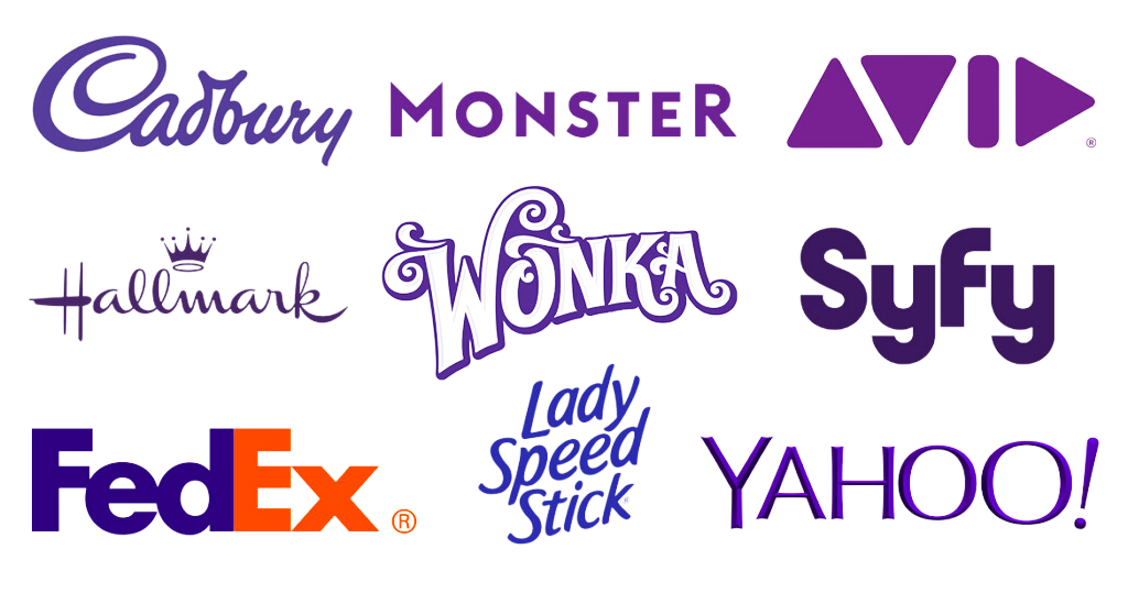
For marketers, purple is a fantastic choice for brands that want to stand out as unique, luxurious, and imaginative. It’s commonly used by companies in the beauty, fashion, and technology industries. Think of brands like Cadbury, which uses purple to convey indulgence and quality, or Hallmark, which associates purple with creativity and emotional depth.
If you’re considering using purple color psychology in your branding and marketing, it’s ideal for industries related to luxury, creativity, and spirituality. It’s a color that can add a touch of sophistication and intrigue to your brand, making it memorable and distinct. If we combine purple with gold or silver prints, luxury, prestige, and quality are achieved.
To recap:
- Physical Reaction: Calming, sparks creativity, soothing, uplifts the spirit
- Emotional Association: Elegance, wealth, creativity, spirituality
- Consumer Behavior: Encourages exploration, attracts those seeking quality and uniqueness, associated with premium products, creates a sense of exclusivity.
- Brands: Cadbury, Hallmark, Yahoo, Taco Bell, Crown Royal
Using Purple Color Psychology in Branding and Exploring Different Shades
Different shades of purple can evoke different responses. Light purples, like lavender, are soft, calming, and often used in beauty and wellness products to promote relaxation. Medium purples are associated with creativity and imagination, making them ideal for artistic and innovative brands. Dark purples convey a sense of luxury and power, perfect for high-end products and services that want to project an image of exclusivity and sophistication. Adding more red gives it a higher level of excitement, and adding magenta can increase the liveliness.

Pink Color Psychology: The Color of Romance and Innocence
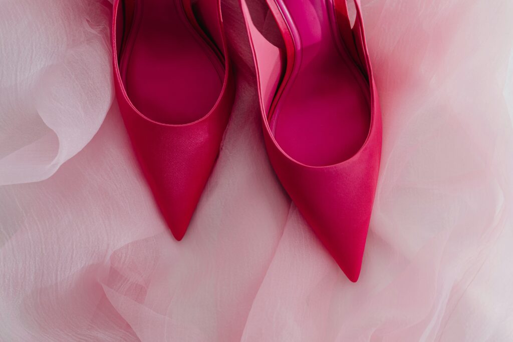
Pink is a color that exudes warmth, tenderness, and femininity. It’s often associated with love, nurturing, and compassion, when using pink color psychology in your branding and marketing, it can be a powerful color.
Understanding the associations we have with Pink
When we think of pink, the first associations that come to mind are often romance, sweetness, and innocence. Pink evokes feelings of warmth and comfort, making it ideal for creating a sense of calm and reassurance. This gentle hue is often linked with empathy and understanding, fostering a sense of kindness and care.
Pink has the unique ability to soothe and relax, similar to blue, but with a warmer, more nurturing, and gentle touch. It’s known to reduce aggression and promote a sense of calm, which makes it an ideal choice for environments where peace and harmony are desired, such as hospitals, nurseries, and wellness centers.
From a psychological perspective, pink is often associated with playfulness and youth. Pink can inspire joy and creativity, encouraging a light-hearted and cheerful atmosphere. This playful quality makes pink a popular choice for brands targeting younger audiences or those wanting to convey a sense of fun and spontaneity.
However, the perception of pink can vary widely. While some see it as a symbol of softness and delicacy, others might view it as overly sweet or lacking in seriousness. So consider your audience when using pink in your branding to ensure it aligns with your brand’s message and values.
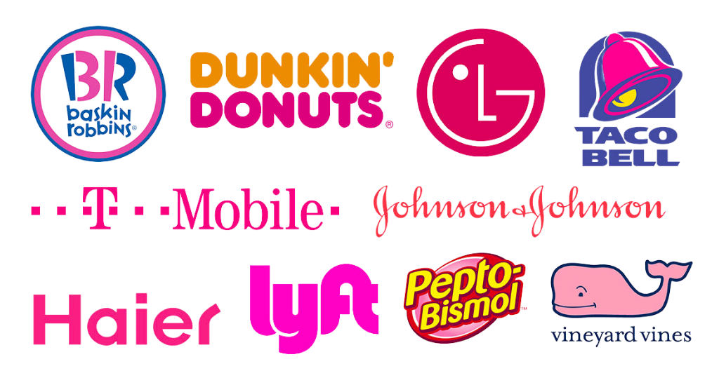
For marketers, pink is a fantastic choice for brands that want to be seen as friendly, nurturing, and approachable. It’s commonly used by companies in the beauty, fashion, and healthcare industries. Think of brands like Victoria’s Secret, which uses pink to convey a sense of romance and femininity, or T-Mobile, which associates pink with innovation and boldness. One brand that has become synonymous with pink is Barbie. Their iconic shade of pink has a sense of femininity, fun, and fantasy, which resonates with their younger audience and has become very memorable.
Brands that use Pink
If you’re considering using pink color psychology in your branding, it’s ideal for industries related to beauty, wellness, and children’s products. It’s a color that can add a touch of warmth and playfulness to your brand, making it memorable and inviting.
To recap:
- Physical Reaction: Soothes and relaxes, reduces aggression, promotes a sense of calm, promotes compassion and creativity
- Emotional Association: Romance, warmth, tenderness, joy, innocence, sweetness, feminine, youthfulness, delicacy
- Consumer Behavior: Encourages empathy, attracts those seeking comfort and care, and is associated with youth and playfulness.
- Brands: Victoria’s Secret, Barbie (Mattel), T-Mobile, Baskin-Robbins
Using Pink Color Psychology in Branding and Exploring Different Shades
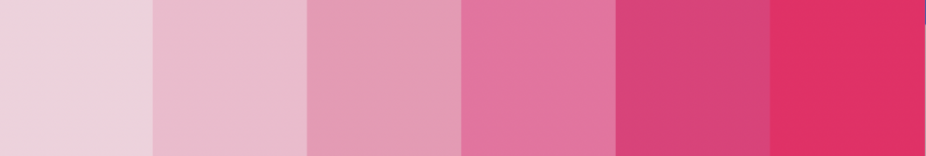
Different shades of pink can evoke different responses. Light pinks, like baby pink, are soft and calming, often used to create a sense of innocence and tranquility. Bright, vibrant pinks, like fuchsia or hot pink, are bold and energetic, perfect for capturing attention and conveying a sense of fun and excitement. Dusty or muted pinks are more sophisticated and elegant, suitable for creating a refined and chic atmosphere.
Black Color Psychology: The Color of Elegance and Power
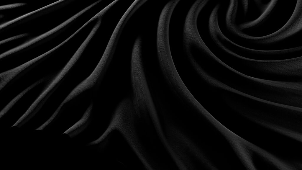
Black is a timeless, sophisticated color that exudes a sense of mystery, authority, and elegance. It commands attention and conveys a sense of strength and sophistication, making it a popular choice in fashion and design.
Understanding the associations we have with Black
When we think of black, we often think of sophistication, formality, and power. It’s effortlessly chic and versatile, suitable for a wide range of occasions and settings. Whether it’s a little black dress or a sleek black sports car, black adds an air of refinement and luxury. They don’t call it a black-tie event for nothing.
Black has a unique ability to create contrast and drama. It’s a color that can make other colors pop and stand out, enhancing their impact and visual appeal. This makes black a popular choice for branding and packaging, as it can elevate the perceived value and quality of a product.
From a psychological perspective, black is often associated with authority and control (think: Men in Black or security guards). It commands respect and instills confidence, making it a popular choice for professional attire and business settings. Black also has a grounding effect, providing a sense of stability and security in uncertain times.
However, black can also be associated with negativity and darkness. In some contexts, it can evoke feelings of sadness or mourning, as it is often the color of funerals. It’s important to use black thoughtfully and in moderation, balancing its powerful presence with lighter colors or accents.
Brands that use Black
For marketers, black is a versatile choice for brands that want to project a sense of sophistication, authority, and luxury. It’s commonly used by high-end fashion brands, luxury car manufacturers, and tech companies. Think of brands like Chanel, which uses black to convey timeless elegance and style, or Apple which associates black with innovation and sleek design.
If you’re considering using black color psychology in your branding, it’s ideal for industries related to fashion, technology, and luxury goods. It’s a color that can add a touch of elegance and power to your brand, making it memorable and impactful. It can also have a degree of mystery or secrecy, especially in packaging—as it conceals whatever is underneath.
To recap:
- Physical Reaction: Absorbs light, evokes seriousness
- Emotional Association: Elegance, power, mystery, formality
- Consumer Behavior: Commands attention, instills confidence, associated with luxury and quality, conveys sophistication, authority, and control
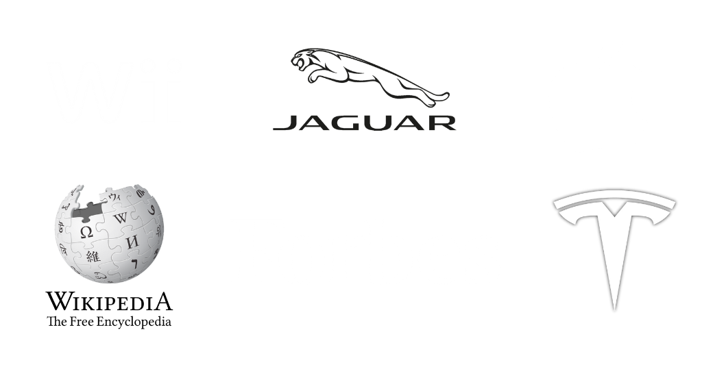
- Brands: Chanel, Apple, Rolex, Mercedes-Benz
Using Black Color Psychology in Branding and Exploring Different Shades
While black is typically seen as a solid hue, variations in texture and finish can create different effects. Matte black is understated and refined, while glossy black is sleek and modern. Metallic blacks, like gunmetal or charcoal, add a touch of depth and richness, perfect for creating a sense of richness and luxury.

White Color Psychology: The Color of Purity and Simplicity
White is a color that symbolizes purity, cleanliness, and simplicity. It’s versatile and timeless and evokes a sense of clarity, freshness, and tranquility, making it a popular choice in various aspects of design and branding.
Understanding the associations we have with White
When we think of white, we often think of purity and innocence. It’s a color often symbolic of new beginnings, fresh starts, and cleanliness. This association with purity makes white the popular choice for weddings, christenings, and ceremonial occasions.
White also has a calming and soothing effect on the mind. it’s a color that can create a sense of space, openness, and possibility, like a blank canvas. It promotes feelings of peace and serenity making white an ideal choice for creating minimalist interiors, meditation spaces, and tranquil environments.
From a psychological perspective, white is often associated with simplicity and clarity. It’s a color that can help declutter the mind and focus attention, making it easier to concentrate and think clearly. This makes white a popular choice for minimalist design and branding, where simplicity and elegance are valued.
However, white can also be seen as sterile or cold if overused. In some contexts, it can evoke feelings of emptiness or isolation. Be sure to use white thoughtfully and in balance with other colors to create warmth and depth.
Brands that use White
For marketers, white is a versatile choice for brands that want to project a sense of purity, simplicity, and sophistication. Using white color psychology in your branding and marketing, will promote hygiene and cleanliness in beauty or healthcare, freshness and purity in food, and simplicity in high-tech industries.
Think of brands like Apple, which uses white to convey simplicity and innovation, or Dove which associates white with purity and gentleness. It’s a color that adds a touch of purity and elegance to your brand, making it memorable and timeless. And it’s also associated with transparency in brands, conveying you have nothing to hide.
To recap:
- Physical Reaction: Reflects light, creates a sense of space and openness, promotes peace and tranquility
- Emotional Association: Simplicity, cleanliness, purity, transparency, freshness, innocence, serenity
- Consumer Behavior: Conveys sophistication, encourages focus and clarity, associated with purity and simplicity
- Brands: Apple, Dove, Tesla
Using White Color Psychology in Branding and Exploring Different Shades
While white is typically seen as a pure and neutral hue, variations in texture and tone can create different effects. Pure white is bright and crisp, while off-white or ivory is softer and warmer. Matte white is understated and elegant, while glossy white is sleek and modern. Each variation offers its own unique qualities, allowing for endless possibilities in design and branding.

Brown Color Psychology: The Color of Earthiness and Reliability
Brown, in all its millions of shades, is a warm and earthy color that evokes a sense of stability, reliability, and comfort. It’s a versatile hue ranging from light tans to deep chocolates, making it a popular choice in both natural and man-made environments.
Understanding the associations we have with Brown
When we think of brown, we often think of the earth beneath our feet—the soil, trees, and rocks. It’s a color deeply rooted in nature, evoking feelings of warmth and groundedness. This association with the earth makes shades of brown the popular choice for creating cozy and inviting spaces.
Brown also has a timeless and classic appeal. It’s a color that never goes out of style (although some may say we bounce between brown and gray tone trends), making it a popular choice in interior design and fashion. Whether it’s a rustic farmhouse or a sleek leather jacket, brown adds a touch of warmth and authenticity to any setting.
From a psychological perspective, brown is often associated with reliability and dependability. Brown instills a sense of trust and security, making it a popular choice for brands that want to convey stability and longevity. This makes brown a common choice for financial institutions, insurance companies, and other businesses where trust is crucial.
However, brown can also be seen as dull or uninspiring if overused. We hear of “Sad Beige girls” because, in some contexts, it can evoke feelings of boredom or stagnation. So if you’re using brown, be sure to use it thoughtfully and in combination with other colors to create visual interest and depth.
Brands that use Brown
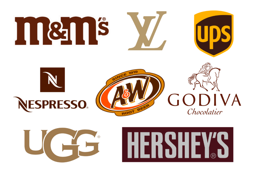
For marketers, brown is a versatile choice for brands that want to project a sense of warmth, reliability, and authenticity. It’s commonly used by companies in the food, hospitality, and outdoor industries. Think of brands like Nespresso, which uses brown to convey a sense of warmth and stability – just what we want from our cup of coffee, or Ugg, which associates brown with durability and comfort.
If you’re considering using brown color psychology in your branding, it’s ideal for industries related to nature, sustainability, and tradition. It’s a color that can add a touch of earthiness and reliability to your brand, making it feel familiar and trustworthy.
To recap:
- Physical Reaction: Evokes feelings of warmth and groundedness, creates a sense of security and comfort
- Emotional Association: Stability, reliability, warmth, earthiness, tradition
- Consumer Behavior: Instills trust and security, promotes a sense of longevity, associated with reliability and familiarity
- Brands: Hershey’s, UPS, Nespresso, A&W, Louis Vuitton, Ugg
Using Brown Color Psychology in Branding and Exploring Different Shades
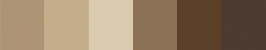
While brown is typically seen as a warm and earthy hue, variations in tone and saturation can create different effects. Lighter browns, like tan or beige, are soft and inviting, perfect for creating a cozy and relaxed atmosphere. Darker browns, like mahogany or chestnut, are rich and luxurious, adding depth and sophistication to any setting. Each variation offers its own unique qualities, allowing for endless possibilities in design and branding.
Using Color Psychology in Branding and Business
I hope that as you read this, you start noticing the colors around you and the effects they can have on your mind or body. Every shade has a story and so many memories that we’ve attached to it. Remember that each person may react differently to certain colors, so while it’s not an exact science—it IS an art. One that brands can use strategically to speak directly to our subconscious.
Understanding the psychology behind colors deepens our appreciation for the art of design and empowers us to make more informed choices in our everyday lives. So next time you encounter a brand or experience a powerful emotion, take a minute to explore WHY they chose that, or WHY you might be affected by the color psychology in their branding.
If you enjoyed the read, check out my other blogs and resources, or check back as I’m always learning, growing, and writing more.
If you are ready to create a brand and website you’re proud as hell to call your own, send me an inquiry!


LEAVE A COMMENT
Comments